Bordeaux color has a rich charisma. Few who remain indifferent to the color of ripe cherries, French wine or chic roses. For a long time this color was considered the prerogative of the nobility and royal blood.
Bordeaux evenly combined chestnut and red colors. The brown shade smooths the dynamism and the excitement of red. And red, in turn, gives the burgundy endless energy, elegant splendor and bright festivity. If you hold an allegory between colors and psychotypes of a person, then red is courage, audacity and youth, and burgundy is confidence, representativeness and maturity.
Today we will talk about what color is in harmony with burgundy and how to use it properly in the interior.
Combination of colors with burgundy in the interior
Bordeaux color in the interior is considered to be elite. Bordeaux in the house does not contribute to complete relaxation, but it is able to help organize all thoughts and concentrate. It is very important to correctly apply this coloring in the house, it is important to combine it with other elements of the decor. Each room has its own combination of colors, so we will further describe what color suits the burgundy for the living room, bedroom and kitchen.
| | | |
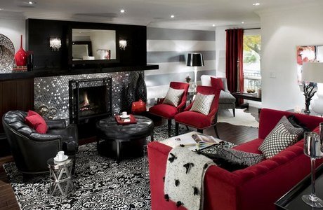
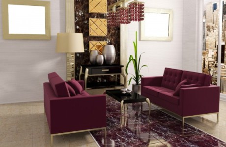
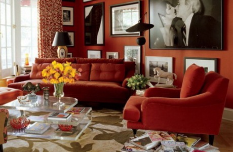
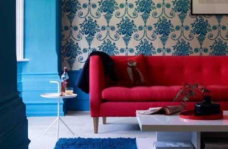
Living room
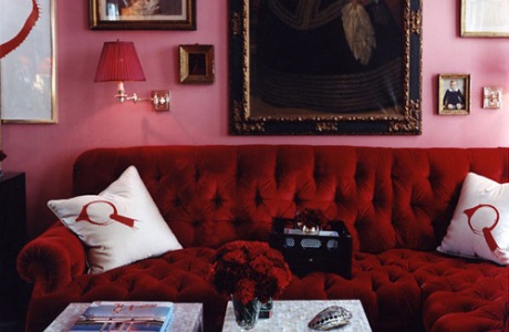
The combination with white color will give a burgundy shade of a ripe pomegranate and make the room more cheerful, energetic and majestic.
| | | |
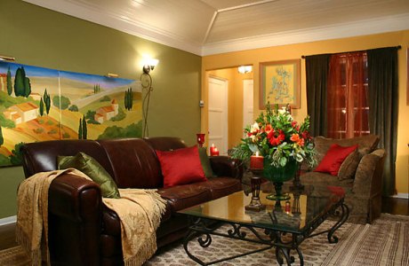
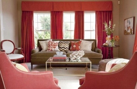
Burgundy, along with brown flowers - one of the classic combinations. This interior will allow you to feel the warmth, comfort and tranquility.
| | | |
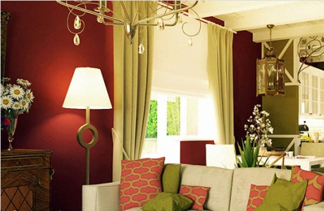
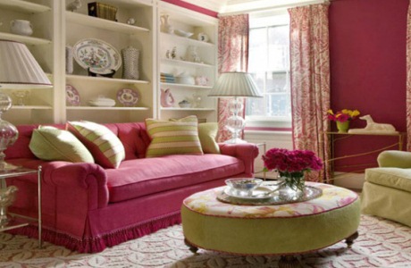
Burgundy with green is a popular compound, but it should be noted that in order not to oversaturate the interior in the room, only small notes of these contrasting colors should be used.
| | | |
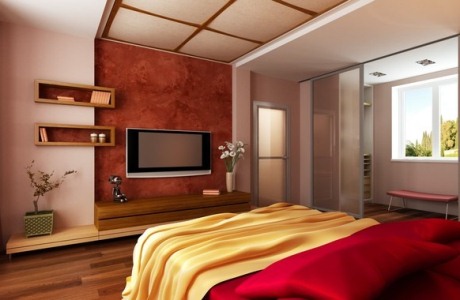
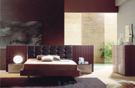
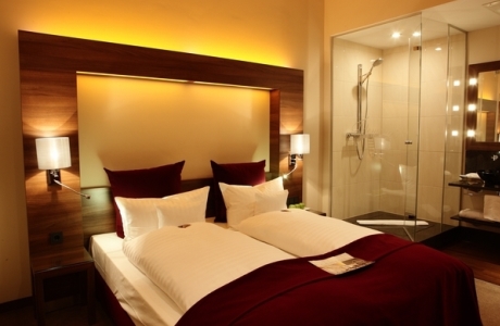
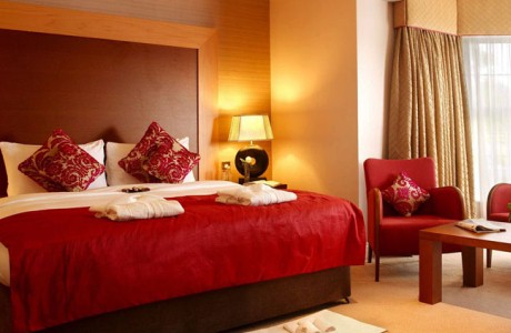
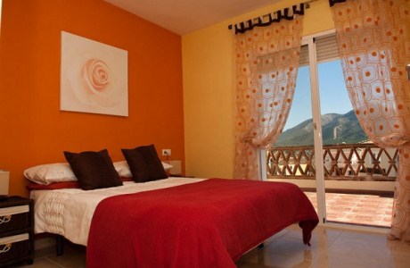
Bedroom
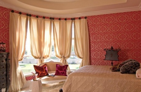
In the bedroom, the color of Bordeaux should be used only as a conductor, and in the basis of a better choice of warm monochrome options. The severity of burgundy colors can be diluted with gentle variations of white and pink.
| | | |
Excellent cherry color rhymes with terracotta and beige, this combination will add a bit of warmth.
| | | |
The richest and most luxurious combination is the color of the Burgundy and gold. To slightly reduce the created celebration, it is better to choose gold elements of a muted green tint, closer to olive.
| | | |
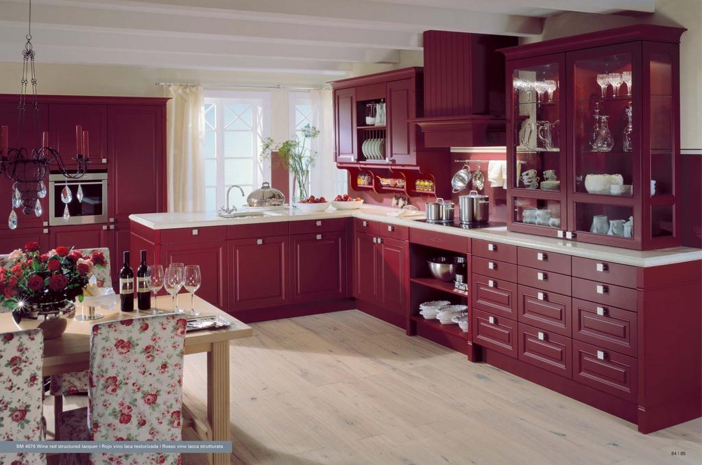
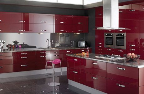
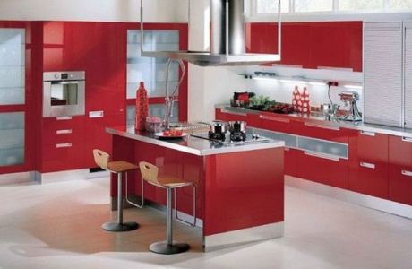
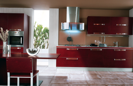
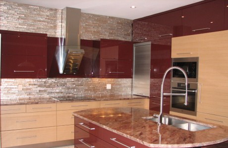
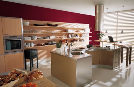
The kitchen . Burgundy in the kitchen is not so relevant, because it does not cause an appetite, like, for example, yellow . Therefore, it is better to apply it neatly, it is possible to highlight only some accents. A good combination of blue and burgundy color, but it is better to combine it with other cold tones, such as turquoise or emerald.
| | | |