The right combination of different colors is the guarantee of a harmonious and attractive interior. Using all sorts of shades without analyzing their compatibility can give a tart and tasteless look even to the most expensive repairs.
Of course, doing construction work, everyone repels from the color that he likes, and then he picks up additional ones. If you know and follow the simple rules of combining colors in design, choosing a successful coloring option is much easier.
Basic rules of color design
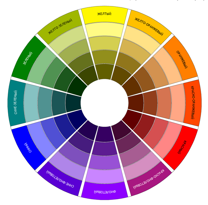
To find the best combination of color solutions in design is not difficult, if you use a color wheel. It is a simplified diagram of all colors, except achromatic - white, black and gray. They are peculiarly ordered, divided into separate sectors and this order obeys strict optical laws. How to use this scheme in work?
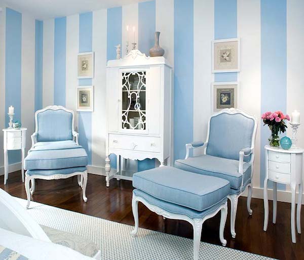
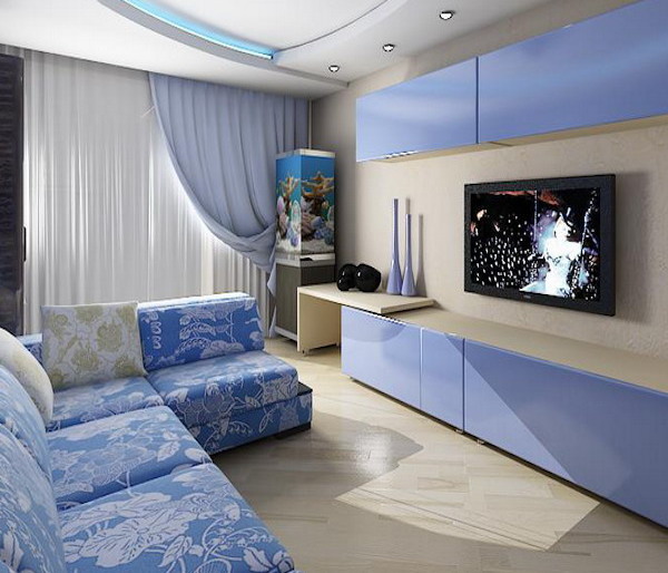
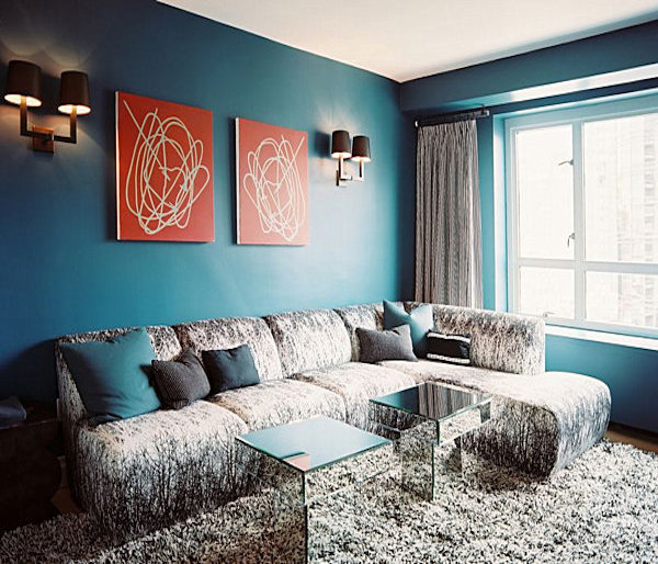
The simplest way is to combine different shades of the same color. This combination is the most soft, pleasant for visual perception of space. For example, connect the room in a pale blue and saturated blue. And, choose one color dominant, and the second auxiliary. A similar combination of blue and blue will fill the room with freshness and cleanliness.
| | | |
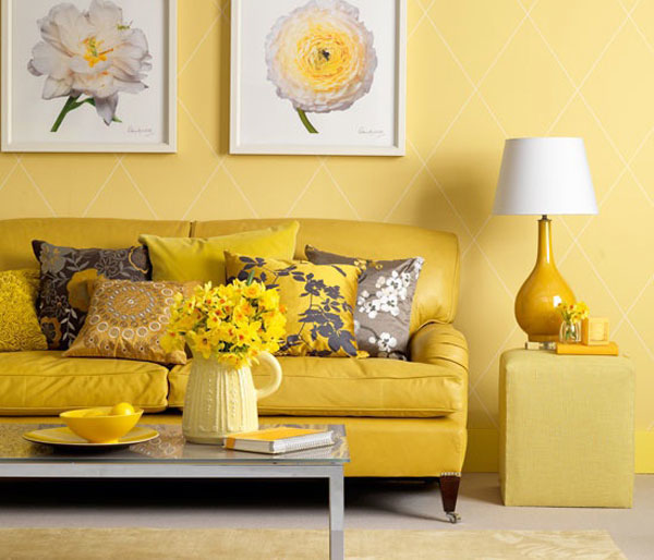
All other colors in this circle are called contrast. And, those that are located next to the selected - it's gently contrasting, they are also well perceived. And the color opposite - sharply contrasting. With this combination, you need to be very careful, because the construction of interior design in polar shades, although possible, but requires additional knowledge and skills. For those who require a variety in design and plans to use 3-4 colors, the color wheel will come again to the rescue. Draw any rectangle in the center - and the colors at its vertices will be the most suitable and compatible with each other. For example, choosing yellow as the basis, complement the design with purple and red-orange accessories.
Original combinations of colors
Most often in the apartments you can find traditional combinations of pastel shades and black and white scales. We suggest to pay attention to several interesting variants of a combination of other colors.
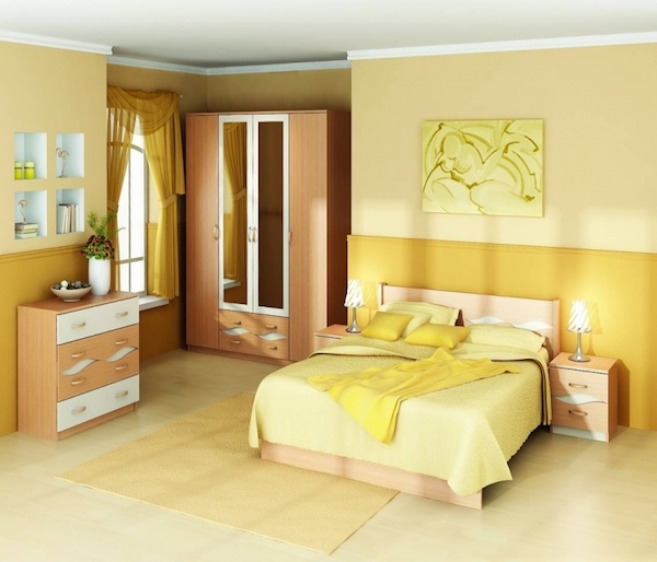
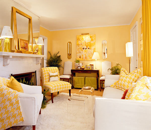
Mustard color is one of the shades of yellow. Get it by mixing with a brown palette, which makes the color soft, warm and saturated. The most successful combination of mustard color is formed with light shades of warm tones. These are beige, light brown, olive . It looks good also in a duet with white, chocolate and terracotta. But do not apply all the right colors at once - limit to one or two additional colors. The presence of mustard color in the room can soothe, warm and tune in a positive way. So feel free to use it in the bedroom and the children's room.
| | | |
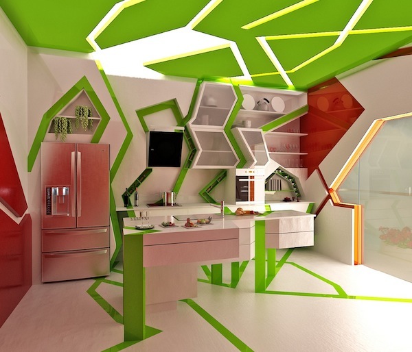
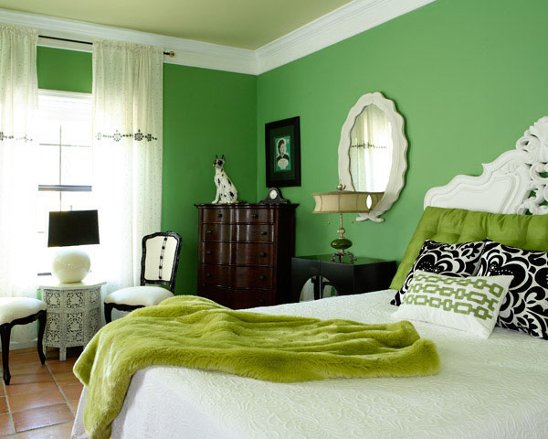
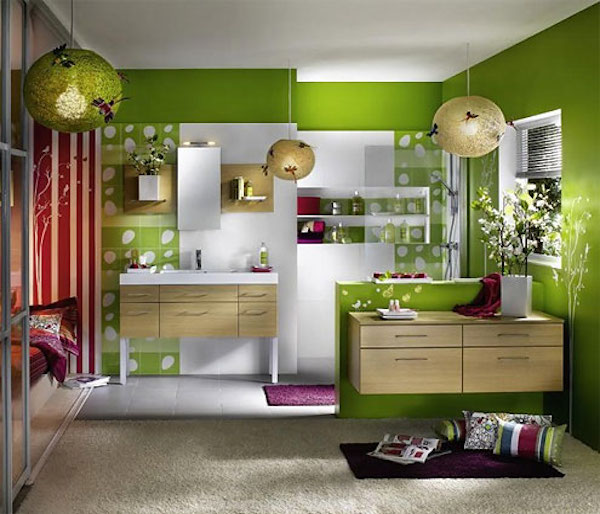
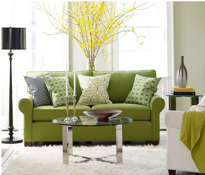
Many people want to fill the space with bright colors, while creating a nice and not too flashy interior. We recommend to look at the green shades. This spectrum is used to the human eye, because it repeats natural natural colors. Also, this color favorably affects the psychoemotional state of the residents, gives a sense of stability and security.
The combination of green with yellow, white and brown shades is considered the most advantageous. It is also permissible to include bright spots of red or orange in the design of the room in green tones, thus each color used will be well-shaded.
| | | |