Interior designers claim that the color scheme for the kitchen can not only affect the sense of space, but cause certain emotions and even appetite. So, if the room is painted in a color that you dislike, then you hardly want to often cook there food or just linger to enjoy the situation. However, if the color is chosen correctly, then the room seems spacious and light, it is comfortable for the whole family.
Tips for color matching
To begin with, you need to remember the basic advice concerning all the premises in the house. Remember that light shades optically expand space, and dark ones on the contrary reduce it. A small kitchenette, painted in bright colors, can cause irritation and even tire your eyes, and a spacious room, made in cold shades, looks gloomily gloomy.
Now you can talk specifically about the "kitchen" rules for the design of space:
- not to lose the main idea of kitchen design do not use more than three colors;
- The shade of furniture should be one tone darker than the color of the walls;
- floor and ceiling must be performed in different shades, in order to maintain the harmony of the interior;
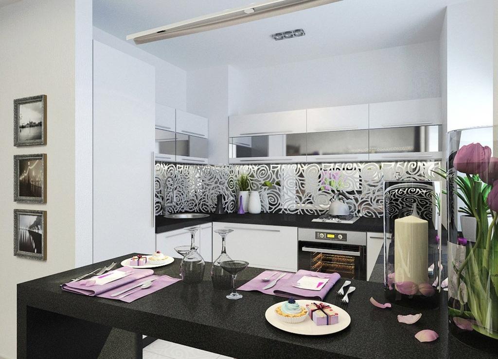
- If the kitchen lacks bright colors, then you can add them with flowers, fruits, napkins or paintings.
Color options for the kitchen
Today the most popular kitchens are:
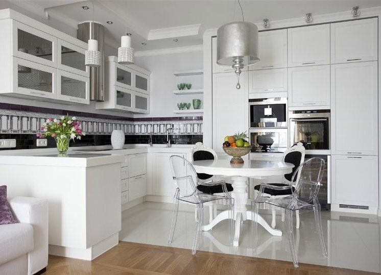
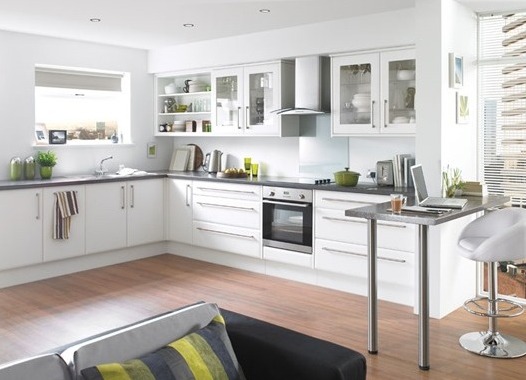
- White kitchen . The visiting card of the hostess, who values sterile cleanliness and regularly cleans. White looks elegant and elegant, but without bright accents can become faceless and monotonous. Here, black, yellow, green, and gray can be used as accents.
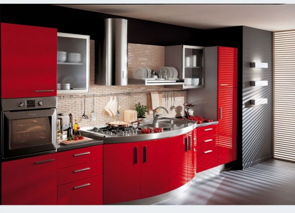
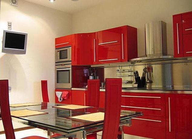
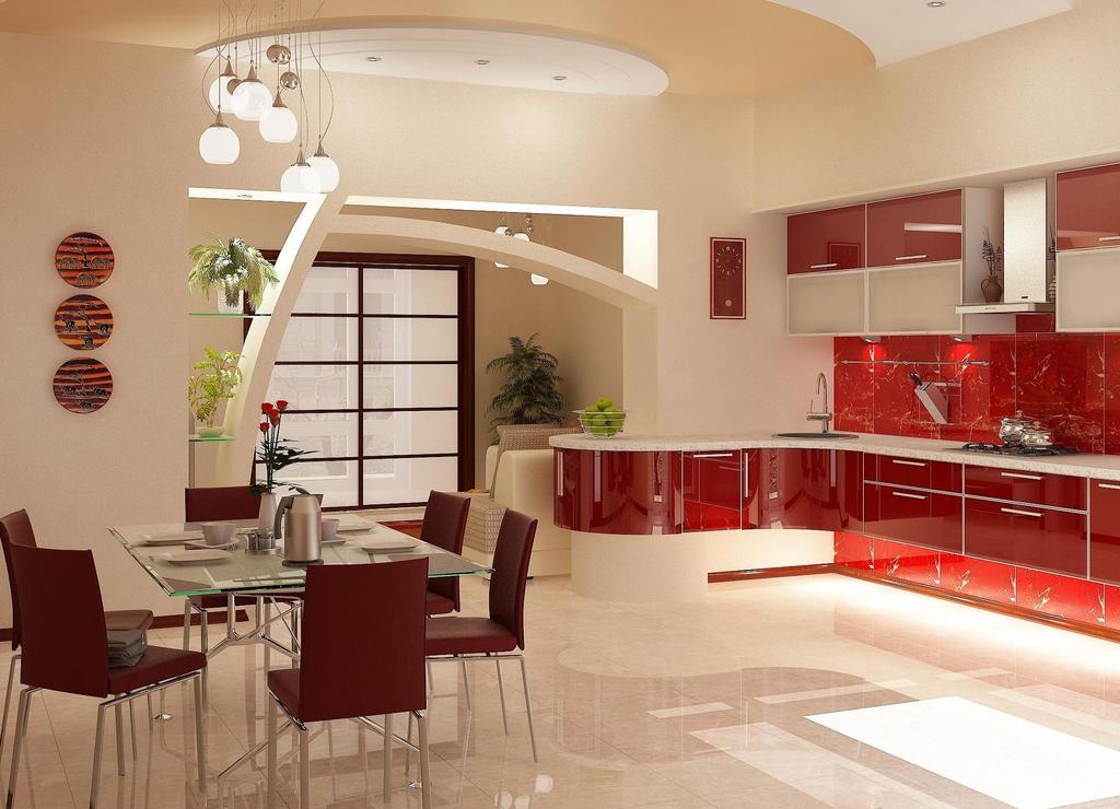
- Red kitchen . It can awaken the appetite, increase vitality and motivate people to act. To bright red does not cause rejection it is better to use its soft shades - burgundy , tomato, coral. Very nice looks a combination of red with glass, metal and gray and white hues.
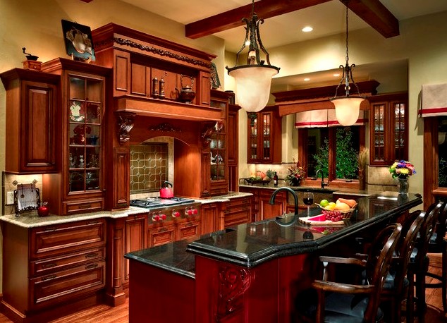
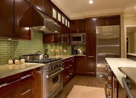
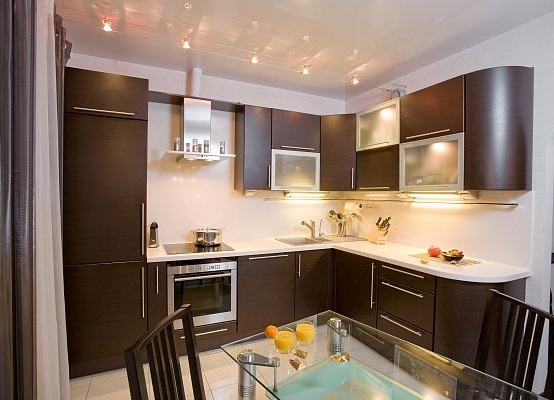
- Brown kitchen . It looks natural and at ease, since brown is a natural shade of wood. To emphasize the depth of this color, combine it with beige, white, red and green .
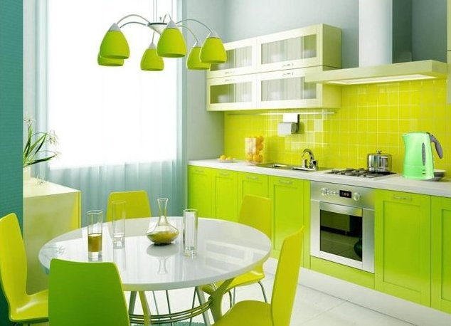
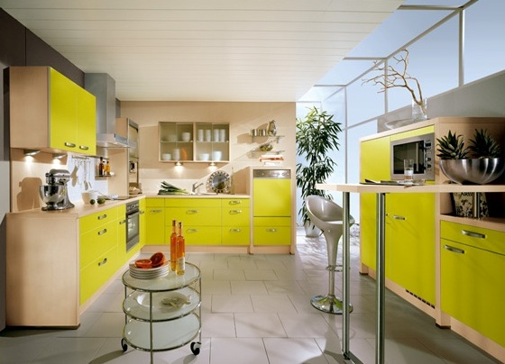
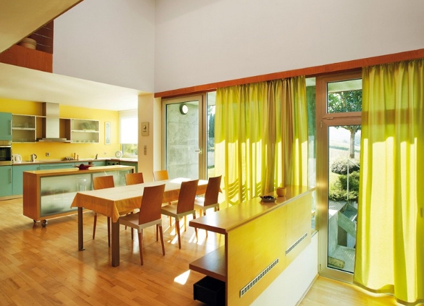
- Yellow kitchen . It raises mood and appetite, can charge a person with energy for the whole day. Yellow color scale in the interior of the kitchen can be present either on the facades or on the walls. The background should be neutral.
| | | |
| | | |
| f | | |
| | | |
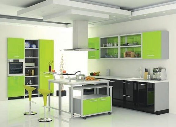
In addition to these options, the kitchens of green, lilac and blue will look great.