The color of the kitchen is able to influence both the mood and the process of digestion, so the choice of furniture and wallpaper should be approached quite scrupulously. To pick up a material for pasting of walls to color facades at times happens inconveniently. Some combinations are capable of annoying or looking ridiculous. Therefore, we suggest that you consider some of the most successful options that you might need when choosing a material for repair.
Kitchen wallpapers in the interior
- Which wallpaper is suitable for a green kitchen set?
- Which wallpaper look better under the gray kitchen set?
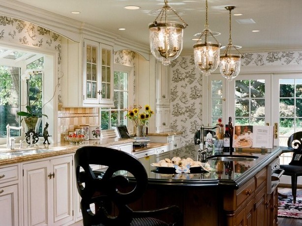
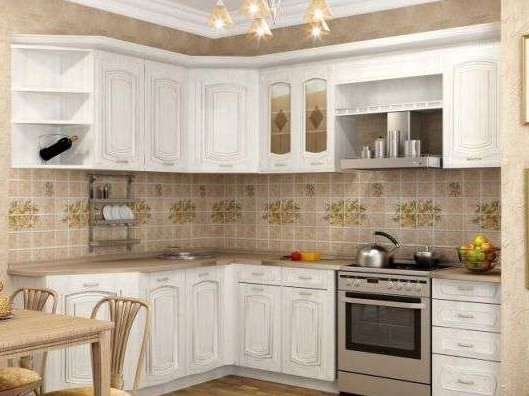
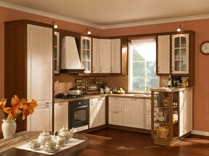
- Wallpapers to a white kitchen set.
- Which wallpaper is suitable for an orange kitchen set?
- How to choose wallpaper for a red kitchen set?
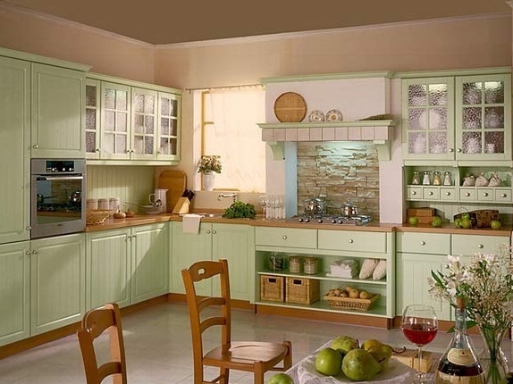
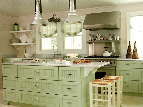
Green furniture radiates calm and positive. In addition, this color is completely different - warm and bright, like spring freshness, and majestic dark green. The first option is more suitable in the style of high-tech, but the darker shades look better in the classical style. Under the green set, the kitchen washable wallpaper of natural colors is preferable. Warm shades of the facade (green, olive) harmonize well with a rich beige, orange, red. Cool shades of green facade (mint, turquoise green, emerald) are in better harmony with the wallpaper of the cool palette. If you want to play in contrast, you can paste and white wallpaper, but the more bright your furniture, the more whiteness should be in the interior.
| | | |
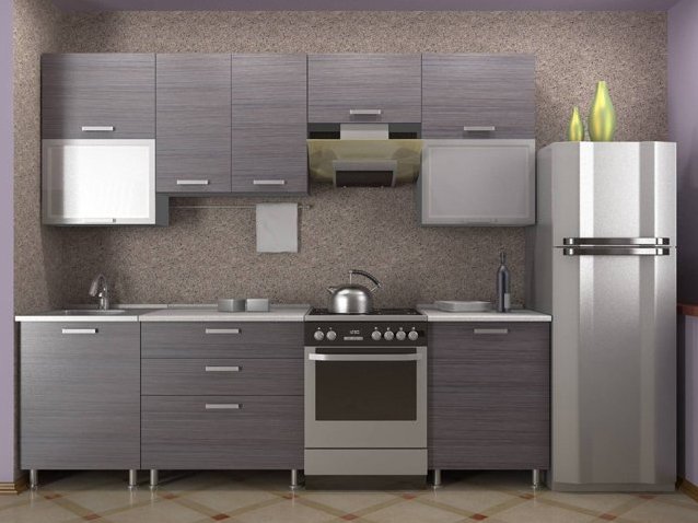
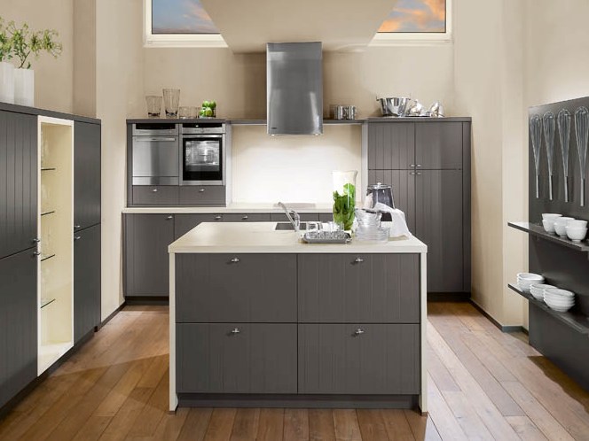
The gray color of the facades is practical, not marchy, has the property not only to reassure, but also to emphasize the wide palette of the surrounding space. In a modern style, walls can be of a variety of shades. Particularly interesting is the gray furniture, standing against the background of bright wallpaper - violet, lilac-blue, lavender . But lovers of classics should buy wallpaper to a gray kitchen set of traditional shades - beige, cream, smoky, beige gray.
| | | |
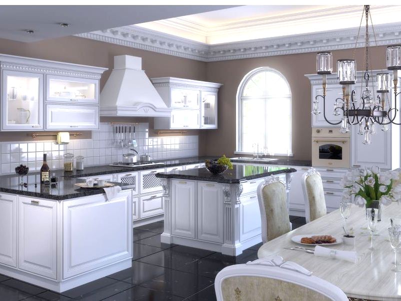
Although many criticize such furniture for impracticality, but it is always popular and looks chic. Fans of pure white cuisine should slightly vary the interior, using kitchen wallpaper with a pattern, having a convex texture. But still sterile whiteness quickly bothers many people, and it is better to dilute it with colored inclusions at once. Most often, wallpaper is cream, creamy, milky. But if you allow bold combinations, you can try to pick up other, more saturated colors - blue, orange, red, blue.
| | | |
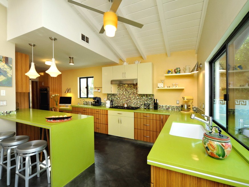
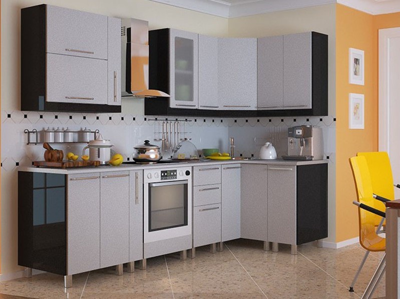
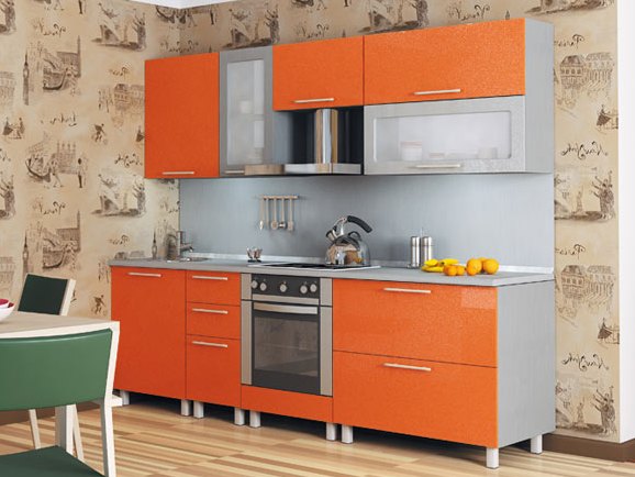
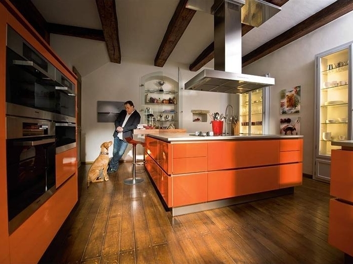
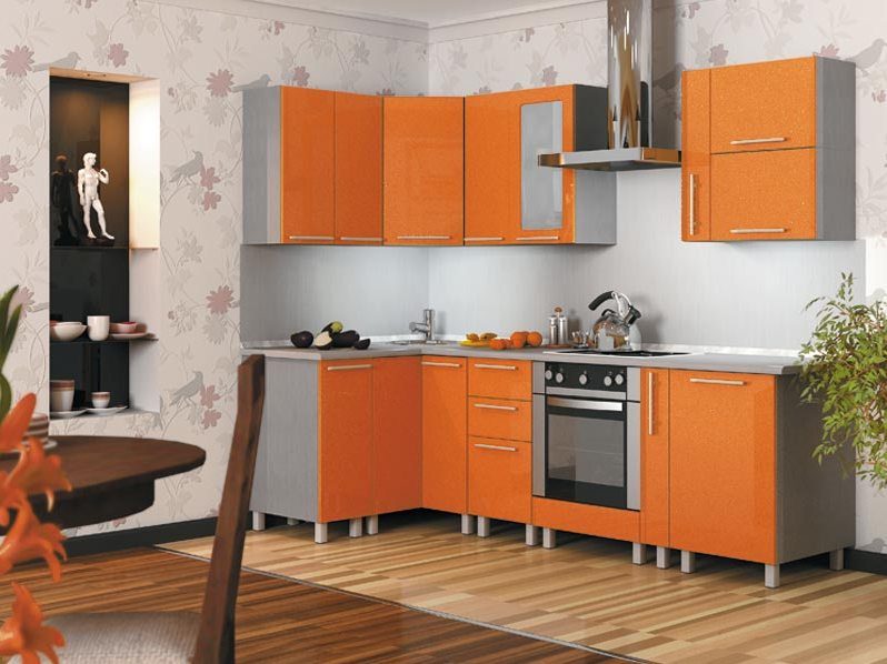
The orange color of the facade and the violet wallpaper are not a particularly good choice, but the soft blue walls look good next to the orange kitchen. This combination is very much like ethnic motives. The same can be said about the green color, here you can experiment only with natural gentle shades. Come to the room with an orange set of cream kitchen vinyl wallpaper, as well as gray, which will balance the bright colors of the facade.
| | | |
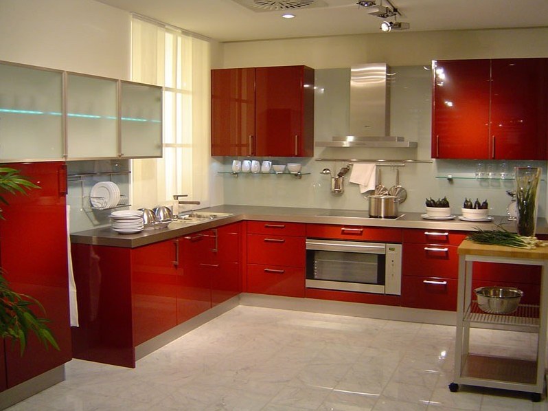
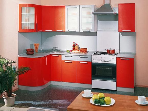
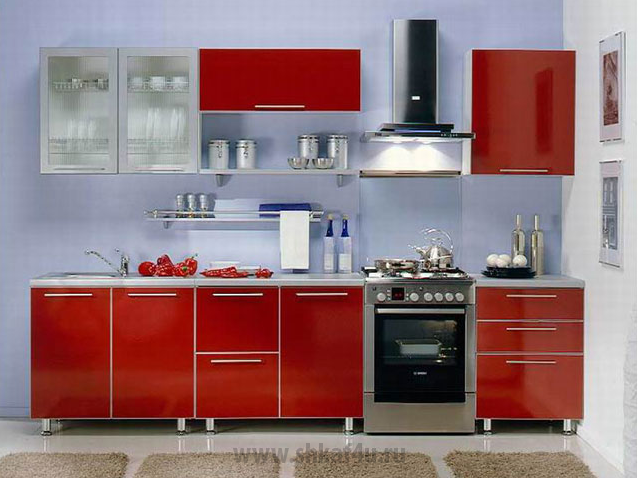
Here we need approximately the same approach as with the orange kitchen. We try first of all to reduce a little effect from excessively bright furniture, and it is the most successful to emphasize its beauty. Most advantageous to use kitchen wallpaper, whose design is made in some neutral color - light gray, ivory, melted milk, milk chocolate.
| | | |