Gray color is both universal and complex for the designer working with the interior. If you use it sloppily, you can create a very depressive atmosphere in the room. Often, this occurs when people choose excessively dark shades of gray. But with the right approach, the situation gets an attractive and even elegant look. The most popular combination of gray with white or black, although you can use different inclusions. The severity of the situation is mitigated by several accent details that stand out clearly against the background of monochrome gray wallpaper.
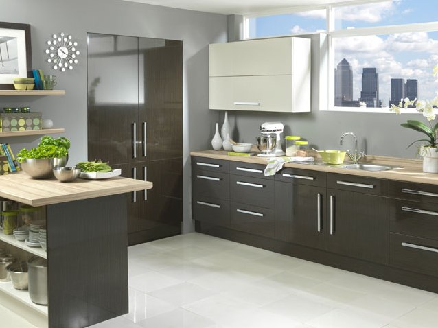
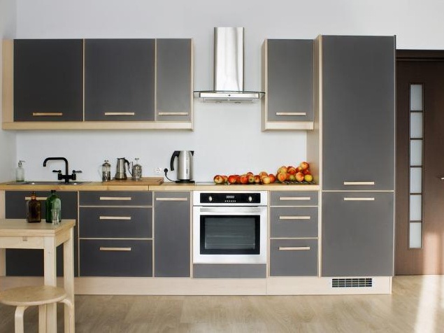
Gray Kitchen Wallpaper
If some housewives look for screaming bright wallpaper in their kitchen, then others like tranquility. Gray walls do not cause fatigue and are perfectly combined with other shades. In addition, there is another argument that should not be dismissed - on such wallpaper any dirt is less visible than on another background. The gray kitchen will almost always look neat and clean. Now in the style of minimalism and high-tech, which use glass , steel, mirrors and plastic metallic colors. Gray wallpapers fit well into this modern-stuffed with novelties.
| | | |
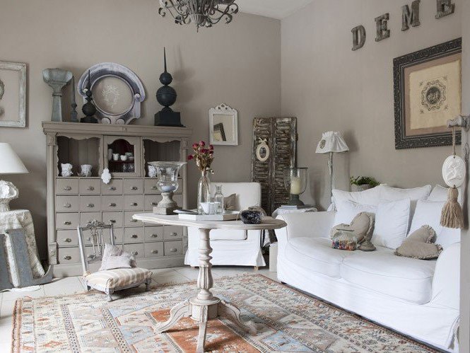
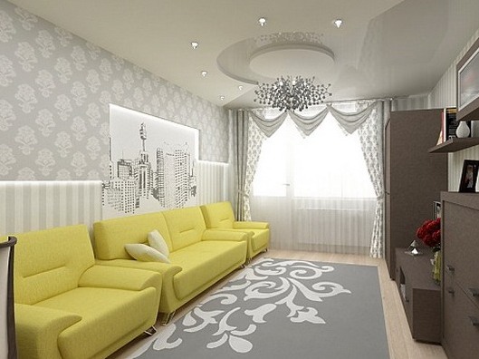
Gray wallpapers in the living room
If you decide to use gray wallpaper in the living room, you must necessarily dilute the overall picture with some lilac, yellow, purple objects. It can be upholstery furniture, a pattern on the carpet, soft cushions or accessories. But they should not be too much, otherwise you will spoil the overall perception of the interior. It will not look as noble as it was intended at the beginning.
| | | |
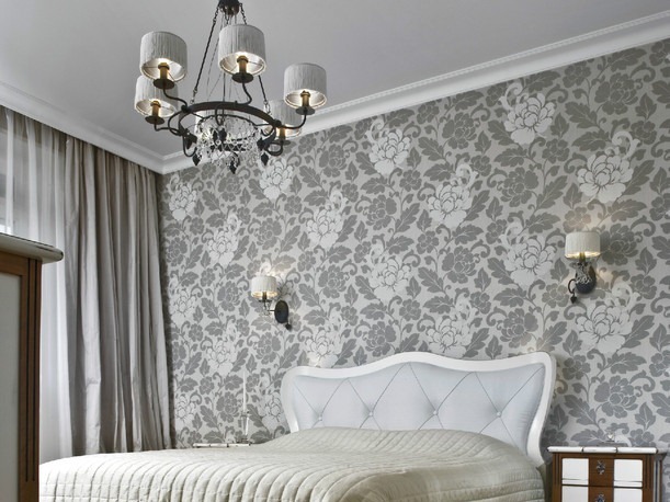
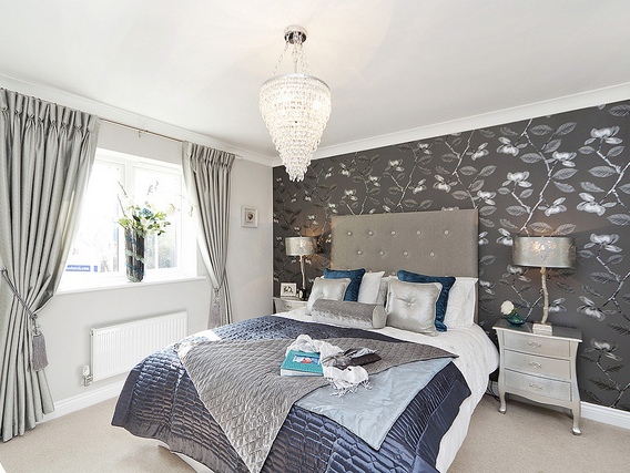
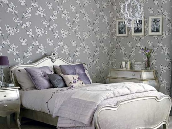
Bedroom with gray wallpaper
A room with gray wallpaper will look a little more fun if you put pads or padded stools that have pink, cream, beige or other delicate color. The gray wallpaper itself does not need to be monophonic, in this intimate room it is better to buy them with flowers, different lines or geometric patterns. Beautifully look such walls, where there is a gray background, on which a plant ornament of another warmer color is scattered.
| | | |
The fabric on the curtains in this case is selected so that it is lighter than the walls, or vice versa, a little darker. Although it can be done differently so that it corresponds to accent inclusions. Depending on the choice, your room will acquire a bright and catchy appearance, or the interior will be calm and balanced.